But first let's start with an old favorite.
The US Dollar Index. Weekly chart.
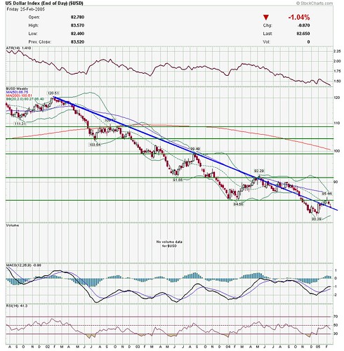
Courtesy of stockcharts.com
Still a downtrend. Interestingly, it broke my trendline, and is sitting just above it, but then it has done this before.
Next is the XOI oil index
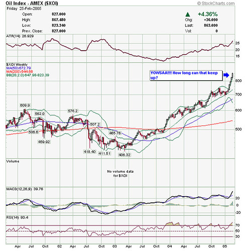
Courtesy of stockcharts.com
Bill Cara is calling this a melt-up top in the oils. Sure looks like it will come down, but when? Bill's a lot smarter at this stuff than I am, and he may well be right--but timing is everything--it may drop on Monday, or it may run another 15% and 15 days before it drops. "Markets can remain irrational longer than you can remain solvent." (John Maynard Keynes).
Next, a new one--the IYR (REIT iShares) Weekly
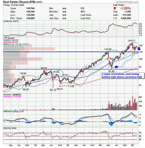
Courtesy of stockcharts.com
To me, looks like support at 110 from the previous high, and a lot of volume in the low 110s. (Although I'm less sure of what volume means in ETFs.) This makes it look like a buyable pullback in REITs.
But let's look at the monthly IYR chart.
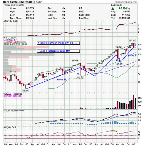
Courtesy of stockcharts.com
REITs have been running for a long time, is this Elliot's 5th wave? Perhaps not, if we can stay above 110? What's that saying, "A man with a watch knows what time it is, a man with two watches is never sure". Substitute "chart" for "watch" and that's me!
Have a great week everyone!
1 comment:
JALOTI,
In regards to the IYR Monthly Chart, take a look at the RSI. This is giving a bearish divergence and is telling the chart reader that the REITS are running out of steam.
These bearish (and bullish) divergences can sustain longer than you think, but they are a sign to keep a watchful eye...especially when they occur on the monthly charts.
Best Regards,
The Soothsayer of Omaha
Post a Comment