Summary
Tufte charges $320USD for a roughly 6 hour course. This price includes a copy of 3 of his books “The Visual Display of Quantitative Information”, “Envisioning Information”, and “Visual Explanations” as well as two essays “The Cognitive Style of Powerpoint” and “Sparklines” and a poster. Retail price of these is about $120 USD. I thought there was very little material he presented that you couldn't get from the books or the website, with one exception—the sparklines material. Many of the points he made, while excellent points, sound obvious in cold print, and perhaps they are.
Clearly, the attraction is seeing the man in person, getting to ask him a question at a break, getting him to autograph your book (I did)

Though he is a good speaker, and clearly enjoys teaching, again, I'm not too sure that much is added by hearing him make the points rather than reading them. In fact, I thought his presentation could have been helped by better organization(His books and essays ARE better organized.) The crowd was easily 300 people--the hotel conference room was completely filled. The audience was somewhat diverse, although I got the impression that it was dominated by web designers and other "artists" types, since the vaguely pro-Macintosh and anti-big business sentiments he expressed seemed to go over pretty well.
My money quote: Don't pay your own money for the seminar unless you're a diehard fan—if your employer pays, though, it's a decent day. You're probably better off buying the books, and if you use these links, I can make a couple bucks off it as well.
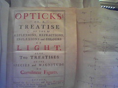
Tufte hates bullet points, so just to be contrary let me summarize with some bullet points. He also says read books, not notes and took a slap at the many internet summaries of his lectures--saying they have no pictures. Thus I will post at least one picture. My interpretation of his points is in normal type, (my comments are in parenthesis, italicized)
- The important question about showing data is "compared with what?" must show casuality, show mutivariate data.
- There is no relationship between amount of detail and ease of reading. To clarify, add detail.
- "Clutter is a failure of design", not the result of too much data
- FINANCIAL DATA
- The central question, the thinking question of most financial data is what is the change over time?
- Although some advocate include zero on the graph, he says don't look at zero point, look at data.
- Show data horizonatally not reaching to a number which never occurs such as zero.
- Giving your audience the chance to confirm a previously known detail helps your credibility.
- When showing data reflecting money over time, must adjust for inflation(doh!) Must adjust for seasonality, cycles(another doh!)
Don't trust display without footnotes--they show presenter takes care in his craft--embedded footnotes help credibility - Bring causality in with annotation (adding a bunch of notes seems like a recipe for cluttering up a chart to me, but that's what he says) For tables/charts of standard financial data do what New York Times, Wall Street Journal, etc, do,--i.e. don't reinvent the wheel find another successful one “don't get it original get it right”
- That having been said, he shows how he has reinvented the wheel with "sparklines"-best described as little tiny graphs without grids that appear on the same line as text--graphics no longer a special occasion--will be everywhere.(I think this is probably one of the most original ideas I got from the course--that graphics could be right within the text--of course he did show an example of this in Galileo's book, with a little drawing of Saturn right amongst the Italian words. I'll try to enter a good scanned example of sparklines in a day or two)
- He advocated using sparklines in stock/mutual fund summary tables. (I think there may well be some merit in this. He then went on to give a poor/incorrect explanation of “closet index funds”. He also seemed amazed that the stock funds had similar performance—he seemed to think that it was only through sparklines that one would figure out that the average large cap stock funds performance was more correlated with the overall market and thus each. Oh well, he's a design expert, not a market guy.)
- WEB SITE DESIGN
- He spent some time railing about how we have to spend too much time thinking about operating systems, and applications, when content is what we should care about. It was a veiled anti-Microsoft, anti-software company rant, talking about being exposed to the "marketing experience" in applications and websites. (I thought this was ironic from a guy who's on tour, filling rooms of >300 people at >300 bucks a head, with his acolytes outside selling his books and posters. Don't get me wrong, I think it's great he can make money doing what he's doing--if I ever get the chance to charge a few hundred people a few hundred bucks each to see me do anything, I'll be there. My point is if he can make a buck doing his thing, why shouldn't Microsoft, Adobe etc. make a buck doing theirs?) On to some website nuts and bolts.
- Unfortunately, design often mimics bureaucracy.
- He says, that almost always, the best web site design is to ****get as much upfront as possible**** (very key, I thought, if not obvious) The best sites have 200-300 links on opening screen one should make everything clickable.
- People come to sites for content, not design
- Took a slap at these flash animation logos that open so many corporate sites—he says it must be recognized they're a waste since they all have "skip intro"(He's right of course but isn't it kind of an easy target?) Biggest issue in web site design is allocation of screen real estate. In many ways the computer screen is just another low resolution display like stone was 6000 years ago. Paper has an advantage in that it is higher resolution and portable.(He emphasized over and over the point about the screen being lower resolution. While it is technically true, I wonder about its practical significance. In my daily routine—and I see literally thousands of websites and pieces of paper every week—I never say “let me print that out so I can get a better look at it. Maybe I'm missing his point somehow.)
-
- ANTI-POWERPOINT STUFF
- (This material all comes from his essay “The cognitive style of powerpoint” which can be obtained here. He offers it for sale on his website, but only on paper, not as even a PDF download, because either a) he wants absolute control over the appearance, b) he wants to make a couple bucks, or c) both (and why not?))
- --"a program whose preoccupation with hierarchy is almost medieval"(perhaps the best quote, and best "a-ha" moment for me all day)
(Ironically, one wag has put together a powerpoint version of his essay.) Powerpoint comes with a cognitive style, an attitude, foreshortening of thought, low resolution, is inherently hierarchical, emphasizes decoration and fluff at the expense of content. It is presenter oriented. It probably works for the bottom 10% of presenters because it forces them to have points. - We are used to examining serious things at 24 inches—computer screen, books; Powerpoint is designed to be seen from 20 ft, thus it is inherently low resolution. (Here his points about resolution of computer versus paper are spot-on, I think.) Bullets are often not subject verb--effects without causes.
- Much of his anti-powerpoint stuff uses the examples of NASA powerpoint presentations about the tile damage on the space shuttle columbia—these presentations arguably encouraged the ill-fated decision to let columbia re-enter.
- Incredibly, NASA even gave powerpoint “pitches” to the review board.
- His other point about Powerpoint (and it's a good one) is that it turns everything into marketing--”pitches”
- He's now giving a mandatory course for NASA employees
Anyway, that's my summary. Clearly, the man is brilliant, and he's got a lot that is worthwhile to say about design. His books are impressive, more impressive in my humble opinion, than the course. Any questions or comments? Either comment below, or email me at harryjaloti@hotmail.com
Finally a little something in the hotel lobby.

Perhaps I've been in Arizona too long, but this I thought this was obvious.
No comments:
Post a Comment